-
LOOK: Google Has A New Official Logo
02 Sep 2015 by Sloane Hunter in History, Lifestyle, Tech/Sci, World
Ta-da!
Go onto Google’s home page right now – I’ll wait for you.
Did you see it? Did you watch the big hand erase Google’s old logo and scribble its new one? Google Doodles are the best.
So, this is Google’s biggest redesign since 1999. Introducing a new sans-serif logo yesterday, the new design was motivated by design austerity, not legibility and elements of it will soon be seen across all platforms. This comes after the company’s major restructuring and the rise of Alphabet.
This isn’t the first time we’ve changed our look and it probably won’t be the last, but we think today’s update is a great reflection of all the ways Google works for you across Search, Maps, Gmail, Chrome and many others. We think we’ve taken the best of Google (simple, uncluttered, colourful, friendly), and recast it not just for the Google of today, but for the Google of the future.
Check out a video of on the evolution of Google itself – including designs, apps and additions though time.
[source: theguardian]
Latest News
-
Cape Town Man Sentenced To Life For Killing His Girlfriend By Setting Her Alight On Women’s Day
[imagesource:dieson] A Cape Town man who tragically set his girlfriend alight in 2017, ...
-
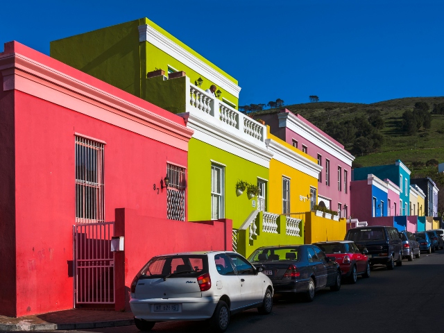
Irate Bo-Kaap Residents Protest Against Tour Buses Clogging Up Their Streets
[imagesource:wikicommons] Residents of the colourful neighbourhood of Bo-Kaap took to t...
-
St John’s College In R60 Million Lawsuit Over Pupil’s Suicide After Sexual Abuse Claims
[imagesource:lekkeslaap] The prestigious St John's College, along with an ex-teacher, a...
-
Only In Mzansi: Model Left Dangling On Cliff In Baboon Bag Snatching Debacle
[imagesource:facebook/mariana keyser] Mariana Keyser found herself in a proper pickle o...
-
Friday Morning Spice
[imagesource:FMT] Outrage And Hope As ICC Issues Warrants For Netanyahu, Gallant And Deif...
-


