-
The Real Reason Behind The Springboks’ Polarising ‘Minty’ New Kit
11 Sep 2023 by Maya-Rose Torrao in South Africa, Tech/Sci, Vibe
[imagesource:twitter/@Springboks]
After enjoying the vigorous performance that our South African rugby team put on this past Sunday for our first game of the 2023 Rugby World Cup against Scotland, I couldn’t help but notice a lot of grumpy comments from local supporters regarding the Bokke’s new team kit.
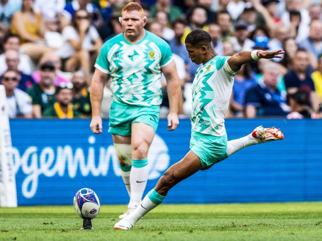
It’s not the geometric-style flair that has Saffas a-buzz with irritation, but the lack of our signature green and gold colour palette. The bright mint-green-slash-turquoise hue sported by the team is a significant change from the usual ‘fits, and although it may seem jarring, there’s a reason behind the big switch-up.
In July 2023, the Springboks unveiled their surprising new “away” kit in the vibrant shade of mint green and sparked a flurry of reactions from fans and social media pundits alike. However, hold onto your critiques for now, because there’s more to this transformation than you’d may expect.
Rian Oberholzer, CEO of SA Rugby, has explained that the new Nike-sponsored jersey sought to pay homage to the Springboks’ traditions but also introduced subtle nuances to set this kit apart from past jerseys. The actual design and construction of the kit remains faithful to the Springbok legacy, but the minty hue is a big leap from previous designs, as many fans noticed.
So, why then, did the Springboks depart from their iconic green and gold?
The answer lies in a desire to be inclusive and accommodating to all rugby fans, including those with colour vision deficiencies. World Rugby recently introduced a new policy, set to come into full effect in 2025, to address the needs of colourblind and vision-impaired fans and the move to a more inclusive sporting world.
In light of this, teams were asked to switch their traditional colours for kits that offered better contrast, making it easier for fans with colour vision deficiencies to distinguish between the teams on the field. This is an important distinction to make, as many Saffa fans have expressed disappointment due to misunderstanding the switcheroo; mistakenly assuming it was linked to an advertising deal.
While the Springbok team themselves have embraced the funky new kit colour for the right reasons, some fans were skeptical and drew attention to the resemblance of the branding to Checkers Sixty60, FNB and Listerine marketing. Awkward.
Assistant coach Mzwandile Stick confirmed that the change in the “away” kit didn’t bother the team at all, despite the backlash. The players understand the importance of accommodating all fans and ensuring that rugby remains a sport for everyone to enjoy. Although I too miss our historical colours, as our world evolves, so should our responses to building a more inclusive way to enjoy global sports competitions.
And while the Bokke’s jerseys may change, the spirit of our team does not. No matter what shade of green we’re rocking, you can be sure the Springbok ruck will smash just as hard.
[source:goodthingsguy]
Latest News
-
Game, Seth, Match – Goodbye 2024
Hey Guys - thought I’d just give a quick reach-around and say a big thank you to our rea...
-
Breakfast Of Champions: Hollywoodbets Kenilworth Racecourse Breakfast Gallops Is Back!
[imagesource:CapeRacing] For a unique breakfast experience combining the thrill of hors...
-
Need NYE Plans? Cafe Caprice’s Night Of Enchantment Masquerade Party Could Do The Trick
[imagesource:howler] If you're still stumped about what to do to ring in the new year -...
-
Buckingham Palace Steps In After Staff Christmas Party Spirals Out Of Control
[imagesource:maxandeli/facebook] It's not just in corporate that staff parties get a li...
-
Designer Babies Are Running Into Trouble As Teens, Grappling With Being ‘Experiments’
[imagesource:here] Imagine being born with the weight of your parents’ version of per...
-


